"Don't mind if I do" Audio Descriptions and Transcripts
There are two audio descriptions with transcripts, the Main Room and the Small Room, one listed one below the other.
Don’t mind if I do: Looping AD Transcript
[Relaxed even voice, American accent]
This project is titled Don’t mind if I do. It runs from January 30 to June 28, 2026 at Smith College Museum of Art.
This project features work by Lukaza Branfman-Verissimo, Pelenakeke Brown, Sky Cubacub, Emilie Louise Gossiaux, Felicia Griffin, Joselia Rebekah Hughes, Jeff Kasper, and me, Finnegan Shannon.
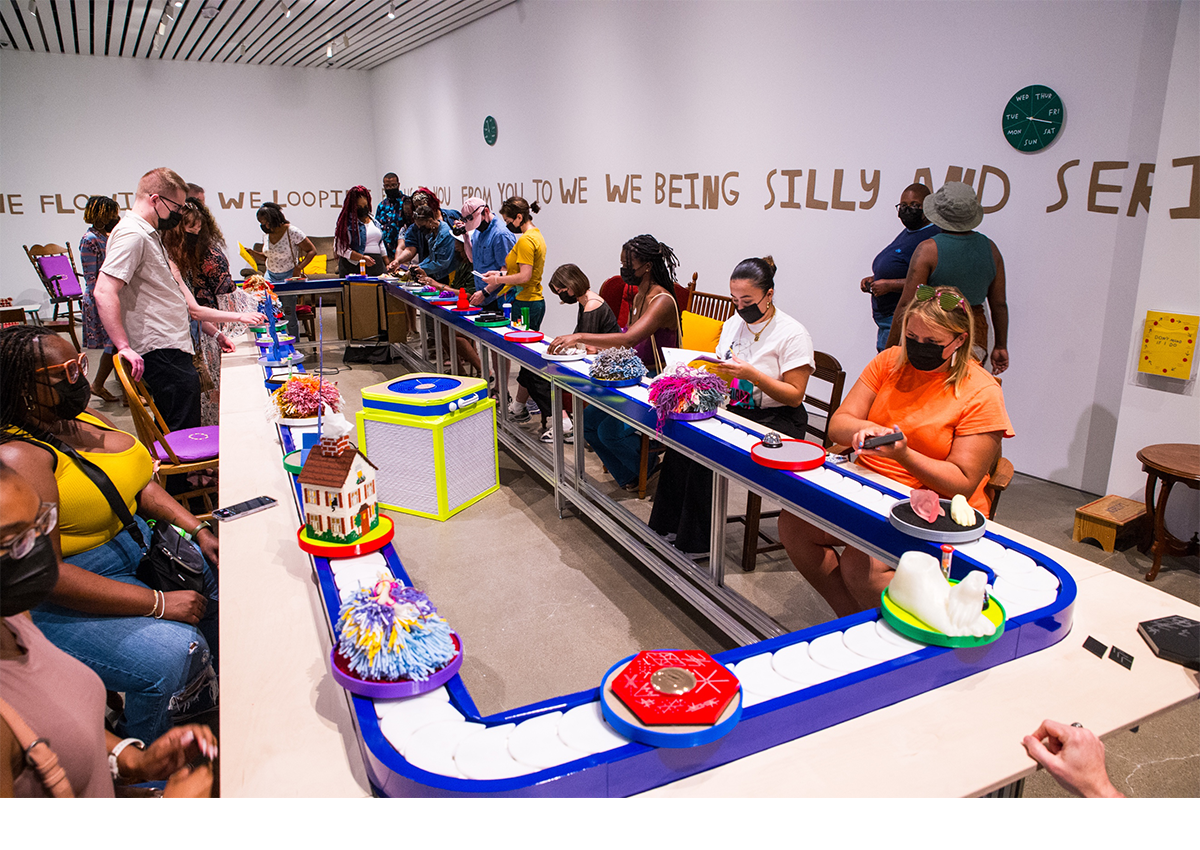
Welcome to my access fantasy. I'm disabled, and I need to sit, and I love to sit. I've been dreaming about an exhibition where instead of having to move from artwork to artwork, I could sit somewhere comfortable and have the artwork come to me. Voilà! Here, we have a conveyor belt of artworks surrounded by a variety of seating options. When planning this project, a big question was, "What artwork should the conveyor carry?" The artists, writers, and thinkers featured here nourish my life and my practice, and I can't resist a chance to share their work. Each of the objects presented asks for varied ways of interacting and opens up possibilities for how and what an artwork can convey.
I invite you to find a spot to your liking. From there, you have options for how you might experience the work. Choose one or a combo. You can watch as a parade of objects moves by you. You can pick something up and spend time with it. Touching things is very much encouraged, though of course, touch with tenderness. Listen to the audio description that's available via the red phone near the conveyor belt, or via scma.smith.edu/audio. The transcript is there, too.
This is Finnegan Shannon, and a lot of the artwork that I contributed to this project are elements of the overall space. The most important element is a work titled My Access Fantasy from this year. It's a conveyor belt from the company 888 Brands Ltd, modified by myself and Peter Reese. This is a 25-foot conveyor belt. Like a long banquet table. It's installed at a little tilt, and it moves all of the smaller objects in a continuous, counterclockwise loop through the space. It has a bright blue edge, I got to pick that color, and each object rests on a little tray that's covered in felt, so each has a little station that it moves around on.
Surrounding the conveyor belt is a bunch of furniture. This work is titled Variety/Comfort/Variety of Comforts. And it's mostly repurposed furniture from Western Mass. We borrowed things from The Eric Carle Museum of Picture Book Art, Mead Art Museum at Amherst College, and the Smith College Theatre Department. It's a real eclectic mix of used furniture. We've got couches, recliners, armchairs, dining room chairs, rocking chairs, kids' chairs, side tables. Also, a real mix of styles. There's leather, there’s velvet, there's wood, there's corduroy. The furniture is arranged some very close to the conveyor belt, again, like you're sitting at a dining room table, and then some are farther back.
We also have eight stools by Lukaza. They are simple wooden stools. Lukaza used a dremel tool to hand carve words into the seats. For example, one says "Sanctuary / Bulletin boards / Care / Porches.” The text is visually hard for me to see but touchable. The stools together are titled Rituals Here Language Archive and they were made in 2022.
There's also a series of work that I made specifically to support the experience of the show. One is called Warmth for Don’t mind if I do, from 2023, and these are two throw quilts that I made. They're simple, nine square quilts with a little embroidered conveyor belt icon in the center. They're hand-tied quilts, and those are things that people can use to stay warm in the space. Museums are notoriously cold! There's also, Air for Don’t mind if I do, also from 2023. There are five of these in the space. There are Corsi-Rosenthal boxes, which is a type of DIY air purifier that's basically three air filters duct-taped into a box, with cardboard on the bottom and a box fan on the top, and it sucks air through the air filters and then up out the top of the box, bringing cleaner air into the space. I had a little fun with the colors in these. All the duct tape is lime green, and the box fans are a nice bright blue.
Another artwork in the space is called Softness for Don’t mind if I do, also from 2023. It's a series of 13 pillows and cushions sewn by Derya Hanife Altan. About half are purple and half are yellow, and these sit scattered over different furniture pieces. Some are really fitted to the shapes of certain chair seats, and others are more like throw pillows. They all have some custom machine embroidery on them that's a circle of dots with arrows between, which is a little icon that I made in reference to the motion of the conveyor belt.
Also in the space is a work called Slow Spin from 2023, and there are a series of seven clocks, but unlike a typical clock that shows the hour and the minutes, these only show the day of the week. The clock hand moves extremely slowly and makes a full rotation every seven days, and it points to the current day. Each of them starts with a different day in the first position. The angle of the hands of all of the clocks are at different angles throughout the space, but they all point to the current day.
What you're listening to right now is also an artwork. It's called Description for Don’t mind if I do, made in 2023 and updated in 2026. It's available on the museum website, and also through an audio station in the space.
There's also a work called Work Info for Don’t mind if I do that's a zine I made with Tom Poole, that lists all of the artwork info with little drawings showing each of the artworks. There aren't wall labels in the space, so this works in parallel to the audio description, in terms of being a way to identify which artworks are by which artist.
This work is by Emilie L. Gossiaux, titled Dog Paw on Foot from 2023, and it's a 3D print made of plastic. There's a little dog paw resting on a representation of a human foot. You can feel the toes, you can feel the little dog claws, and they're stacked. It reminds me of sometimes when a dog wants to get your attention, or steps on your foot. Or almost like holding hands, but holding feet.
Felicia Griffin, titled Pom-Pom. Material is yarn and here courtesy of the Artist and NIAD Art Center. Felicia's pompoms are soft and fluffy, and asymmetrical. They use a variety of materials, so some parts are woolier, some parts are stringier. Sometimes there will be one really long string, and they're big. They're maybe the size of cabbage or a dinner plate. I think that's all I have to say…
This work is by Lukaza Branfman-Verissimo, titled To Fly As a Collective We, In Rooted Ritual, from 2023, cardboard and acrylic paint. This is a cutout winged shape. It reminds me of a butterfly loosely. First it was painted black, and then the text emerges from the negative space. It spans the wings of the shape, and it's very hand-lettered. There's some looseness to the letter shapes, and they become thinner at points, and thicker. One side reads, "In rooted ritual." The other side, again, filling up the shape is text that reads, "To fly as a collective we." The words get broken up. For example, there's an A on one wing tip, and an S on an opposite one below it.
This artwork is by Jeff Kasper. It's titled Wrestling Embrace from 2023. It's a series of 40 playing cards featuring contemplative and interactive prompts for pairs. It's an open edition. I'm holding a black box. The front says "Are you... wrestling embrace. Relationship exercises by Jeff Kasper." The back of the box has instructions. It reads, "Find a partner, draw three cards per person. Don't share your cards unless otherwise noted. Read the top of the card to establish a distance. Get comfortable. Use verbal language if you must. Set a timer if you wish. Negotiate consent. Perform or contemplate the card. If you draw a blank, improvise. Stop at any time. Always prioritize respect. Please return the cards when finished." There's a little icon of a knot, and below that it reads, "These exercises encourage physical touch, guided contemplation, and interpersonal communication. If you are not in the body/mind/emotional space to relinquish personal boundaries, this might not be for you."
When I open the box, there's a small instructional booklet. It repeats some of the information on the exterior of the box, and also says, "Talk about your intentions with your partner. You don't necessarily have to tell them exactly what you're planning at all times. Sometimes surprises are fun, but you don't want to do anything your partner hates, either. Pay attention and slow down. Don't rush into things you haven't tried yet. Establish a safe word, or a code word that means, "Stop. Really, I mean it." If you're playing non-verbally, establish another way to say, "Enough." One common solution is to ring a bell. Be a calming agent. Regardless of whether you seek to resolve conflict with your partner or you are dealing with your own conflict, your response can escalate or decrease the intensity of the problem. To be calming, provide an objective or neutral point of view. Encourage the formation of an actionable plan of how you're going to work with your partner to achieve a resolution."
We also have a little bio for Jeff. He's an artist, designer, facilitator, and educator living in western Massachusetts. His work inspires cultures of trauma-informed support, and circulates resources through publications, media and conceptual social spaces, @JeffKasperstudio.
I've drawn three cards. The back of the first has a simple looped-knot. The card reads, "Hold the distance no more than three feet. Take on the role of an interrogator. Attempt to extract information from your partner. Be persuasive without causing harm. Use words only if you must. Note: this kind of scenario can be psychologically triggering for some people. Therefore, it's very important that each person be alert not only to the physical safety, but also to the emotional state of each partner. It's vital that you be alert to any sudden and unwanted panic or emotional reactions, and that you be ready to end the scene if it should occur. Establish a safe word before you begin. Either person can use this word to end the scene. We recommend the safe word, "Trust."
The second card has a ladder-shaped knot on the back. The card reads, "Keep a distance of less than one foot. Approach your partner carefully. Smile and say some caring words, or compliments. Mean it. What do you notice that you admire or respect? Let them know."
The third card has a very loopy knot on the back. It reads, "Hold a distance of no more than four feet. You may choose to share this card with your partner. Start out with a pretty easy goal, and work your way up from there. Set a timer for five minutes, and focus completely on your partner for that time period. If time allows, then take a two-minute break before going at it again for another five minutes. Repeat this action each day. Add another five minutes to practice focusing, allotting an additional two or so minutes as a break. In more than a week, you should be able to be with your partner for 45 minutes straight before you allow yourself a half-hour break. Once you get comfortable, you can work to lengthen your focus time a little while shortening your break times."
The cards are also paired with a small timer that says a length of time. I'm pretty charmed by the fact that they're color-coded, and the sand in the timer is also color-coded. The one I'm holding is for five minutes, and it's bright green, with bright green sand.
Ringing the whole space is a work by me, Finnegan Shannon, and Lukaza Branfman-Verissimo. It's titled We Hold Us. It's from 2023, and the material is a wall mural. It's about my shoulder height above the ground, or maybe a little more, four and a half or five feet above the ground, and it runs along the wall all the way around the space. Each letter is cut out of this material called chipboard, a thin cardboard, and each letter is cut out individually. Half were cut out by Lukaza, and half cut out by me, and they're adhered to the wall, to string together this poem that Lukaza wrote. They wove together some writing that I had done about the show, some phrases I had thought of related to the show, and some of their own writing.
Now, I'll read the poem. "We on our way. We want to meet you. We access fantasy. We sit and enjoy. Don't mind if we do. We links in a chain. We flowing. We looping. From us, to you. From you, to we. We being silly and serious. We hold us."
Emilie L. Gossiaux, Tongue and Paw, 2023. It's a 3D print made of plastic. The paw is a dog paw. When I hold it, it really reminds me of when I do shake with a dog. It really has that feel of a dog's paw. The tongue is made of a rubbery material, so it's a tongue and lips, but it has this strange, soft material. It has the jarring feeling of almost if you were to actually touch a tongue in this space.
This is a work that me, Finnegan Shannon, made for the conveyor belt. It's titled House that I Modified to be Stair Free, and Planted Lavender in the Garden for Us. It's from 2023, and it's made of a modified vintage tissue box cover kit, so it's a tissue box cover shaped like a house, needle-pointed. It has windows and curtains, and a little door, and a sweet cat in the window, a shingled roof, a little brick chimney. There are bushes and greenery in the garden, and there are tissues that come out of the chimney, almost as though they're smoke, and the tissues are for the taking. All of the stitches that indicate flowers in the garden, and bushes, are lavender colored.
This artwork is by Jeff Kasper. It's titled Wrestling Embrace from 2023. It's a series of 40 playing cards featuring contemplative and interactive prompts for pairs. It's an open edition. I'm holding a black box. The front says, "Are you... wrestling embrace. Relationship exercises by Jeff Kasper." The back of the box has instructions. It reads, "Find a partner, draw three cards per person. Don't share your cards unless otherwise noted. Read the top of the card to establish a distance. Get comfortable. Use verbal language if you must. Set a timer if you wish. Negotiate consent. Perform or contemplate the card. If you draw a blank, improvise. Stop at any time. Always prioritize respect. Please return the cards when finished."
There's a little icon of a knot, and below that it reads, "These exercises encourage physical touch, guided contemplation, and interpersonal communication. If you are not in the body/mind/emotional space to relinquish personal boundaries, this might not be for you."
When I open the box, there's a small instructional booklet. It repeats some of the information on the exterior of the box, and also says, "Talk about your intentions with your partner. You don't necessarily have to tell them exactly what you're planning at all times. Sometimes surprises are fun, but you don't want to do anything your partner hates, either. Pay attention and slow down. Don't rush into things you haven't tried yet. Establish a safe word, or a code word that means, "Stop. Really, I mean it." If you are playing non-verbally, establish another way to say, "Enough."
"One common solution is to ring a bell. Be a calming agent. Regardless of whether you seek to resolve conflict with your partner or you are dealing with your own conflict, your response can escalate or decrease the intensity of the problem. To be calming, provide an objective or neutral point of view. Encourage the formation of an actionable plan of how you're going to work with your partner to achieve a resolution." We also have a little bio for Jeff. He's an artist, designer, facilitator, and educator living in western Massachusetts. His work inspires cultures of trauma-informed support, and circulates resources through publications, media and conceptual social spaces, @JeffKasperstudio.
I've drawn three cards. The back of the first has a knot in one line of rope. The card reads, "Hold a distance of no more than two feet. Consider asking your partner what they are fearful of, and why that particular thing upsets them so much. Tips. The act of exposing a fear can have the effect of neutralizing it. Don't make fun of your partner for it. They must go through their own journey."
The back of the next card has a knot that's a loop, and then almost looks frayed. The card reads, "Hold a distance near embrace. Share this card with your partner. Clarify ambiguous terms with your partner. Think about concepts that each of you may interpret differently. In training our capacity to be together, living with ambiguity is just as important as striving for clarity. Often, they're part and parcel. Practice by saying something that matters to you. Have your partner do the same. Always ask, "What do or did you mean by that?" Or, "It seems that you mean or meant... is that true?"
The third card has, I think this is called a square knot, two ropes looping through each other. It reads, "Hold any distance, recite, "Heartbreaks and promises, I've had more than my share. I'm tired of giving my love and getting nowhere. What I need is somebody who really cares. I need a lover, a lover that wants to be there. It's been so long since I've touched a wanting hand. I can't put my love on the line, this I hope you'll understand. So baby, if you want me, you've got to show me love. Don't you promise me the world, I've already heard. This time around for me baby, actions speak louder than words."
This piece is by Emilie Louise Gossiaux, titled Red Dog Kong from 2023, and it's a 3D print made of plastic. This piece has a snowman shape. It's three balls that are stacked on one another, getting slightly smaller. It's made to look and feel like a dog Kong toy, but this is based on a ceramic piece that Emile made, so it doesn't have the evenness of something that was manufactured, but it's to scale with that, so it fits in two hands.
This work is by Jeff Kasper, . It's from 2023, etched compact mirror in gold, titled Things Remembered [I look fabulous, but I'm in a lot of pain]open edition. This object is really shiny. It picks up the reflections of everything around it, including me. I see myself layered with the engraved text that says, "I look fabulous, but I'm in a lot of pain." It opens with two mirrors inside, where I can again see parts of myself and my surroundings reflected in the piece.
Sky Cubacub, black chain maille packer made of chain maille. It's a full Persian weave with anodized aluminum jump rings, courtesy of Rebirth Garments. The packers fit in my hand, and they're smooth, and these entangled chains. They feel really good. They remind me of stim toys. They make me want to move my hands over them, and feel the texture of those aluminum rings, feel those surfaces.
This artwork is by Jeff Kasper. It's titled Wrestling Embrace from 2023. It's a series of 40 playing cards featuring contemplative and interactive prompts for pairs. It's an open edition. I'm holding a black box. The front says, "Are you... wrestling embrace. Relationship exercises by Jeff Kasper." The back of the box has instructions. It reads, "Find a partner, draw three cards per person. Don't share your cards unless otherwise noted. Read the top of the card to establish a distance. Get comfortable. Use verbal language if you must, set a timer if you wish. Negotiate consent. Perform or contemplate the card. If you draw a blank, improvise. Stop at any time. Always prioritize respect. Please return the cards when finished."
There's a little icon of a knot, and below that it reads, "These exercises encourage physical touch, guided contemplation, and interpersonal communication. If you are not in the body/mind/emotional space to relinquish personal boundaries, this night might not be for you."
When I open the box, there's a small instructional booklet. It repeats some of the information on the exterior of the box, and also says, "Talk about your intentions with your partner. You don't necessarily have to tell them exactly what you're planning at all times. Sometimes surprises are fun, but you don't want to do anything your partner hates, either. Pay attention and slow down. Don't rush into things you haven't tried yet. Establish a safe word, or a code word that means, "Stop, really." I mean it." If you're playing non-verbally, establish another way to say, "Enough." One common solution is to ring a bell. Be a calming agent. Regardless of whether you seek to resolve conflict with your partner or you are dealing with your own conflict, your response can escalate or decrease the intensity of the problem. To be calming, provide an objective or neutral point of view. Encourage the formation of an actionable plan of how you're going to work with your partner to achieve a resolution."
We also have a little bio for Jeff. He's an artist, designer, facilitator, and educator living in western Massachusetts. His work inspires cultures of trauma-informed support, and circulates resources through publications, media and conceptual social spaces, @JeffKasperstudio.
I've drawn three cards. The back of this card has a very loopy and asymmetrical knot. A lot of the lines are together throughout the knot. It reads, "Keep a distance of less than one foot. This card requires consent. Reflect on a time you're hugged by another person, two arms around your upper body forming a close embrace by crossing necks, resting each other's heavy heads on each other's shoulders. Think of a situation like a birthday party or a family reunion. What might that hug feel like? Recreate that hug with your partner."
The next card, the knot on this card is another one where they start from opposite sides and loop through each other before going back on their way. It reads, "Keep a distance of no more than one foot. Sit or stand very still. Follow the subtle movements and gestures of your partner. Carefully scrutinize every inch of their body from head to toe. Notice without judgment what they might want you to ignore. Keep this up for at least five minutes. Let your mind wander naturally, but always return to your partner. If you do need to center on the sound of their breath or your own, do so."
The third card, the knot on this card is smaller. It's like the last one, but one line jets out to the side. It reads, "Hold a distance no less than two feet. Think about doing something that you know will definitely humiliate your partner. Before you do that thing, do the exact opposite."
This piece is by Lukaza Branfman-Verissimo, titled Winged Survival, from 2023. It's made of cardboard and acrylic paint. This is the tallest object on the conveyor belt. It juts up. It has feathered, pointy shapes coming down the side, like a drawing of a pine tree, and there's handwritten text that fills the full shape. On one side, it says, "Winged survival." The words fill the whole space, and so the breaks are in different places, so it takes a moment to puzzle out the flow of the letters, and make out the words. The other side says, "We hold us."
This is a work by Pelenakeke Brown titled Sit with me. It comes in wooden and plexi versions. It is a set of geometry blocks that can be infinitely rearranged as you like. The surfaces of the pieces are lightly etched with drawings that Pelenakeke made using keyboard symbols. The red plexi version is vibrant and translucent and reminds me of jello or candy.
This piece is by Joselia Rebekah Hughes and includes a letter and three jumbo pill bottles. The letter reads:
Dear Fellow Travelers,
I'm your prescribing writer-artist, JRH. I want to speak as directly as I can to you given the physical distances between you and I. I may not be There but, rest assured, we are here together.
A few notes:
1) Finish reading these instructions before engaging with the work. Or don't. I get it: a disembodied voice giving you instructions feels unnecessarily mystical. Lean in? Lean out? Whose voice are you feeling? You're going to do what you want anyway.
2) I would deeply appreciate you write or draw on the sheets of paper in the bottles. Please sign your creations (what you make is for us with your initials and favorite numbers). Please remember your favorite number(s) for an indefinite amount of time. Forget your initials, especially legally, if need be.
3) Please return the creations to the bottles when done.
4) Return this letter to where you found it.
5) Whether or not you play along, we can play a long game. Glean in?
Glean out? Have fun.
With hope's daily practice for a more just today and tomorrow,
JH
1,3,22
The pill bottles are each labeled following the formatting of prescription labeling. All are from Verbena’s Apothecary. “Prescribing writer: JHR.” for “Embodied being in need.” The green bottle says “WRITE FROM YOUR MOST FEROCIOUS BITE. WRITE WHAT’S STUCK AND STICKING, WHAT’S FIERY AND TICKING.” Or the orange one says, “WRITE HOW YOU PRACTICE REST, COURAGE, COWARDICE, ACCEPTANCE, GENEROSITY, TOMORROW…”
Inside of the pill bottles are mini pencils and paper. The work is titled Verbena’s Apothecary and it is an ongoing work that started in 2021.
There are three readymades on the conveyor belt that are all artworks by me. Earplugs that visitors can take and use, titled Wow i wish the conveyor motor didn’t make a sound. Two large-print playing card decks, titled Extra play for Don’t mind if I do.
And a book called a Selection of Snapshots Taken by Felix Gonzalez-Torres, titled My favorite book. It’s my favorite book! It’s point and shoot photos that the artist took of his everyday life. His cats, still lives at home, birds in the sky, flowers, casual photos of artworks. Some include notes to friends on the back. My favorite page is a photo of two cats and assorted figurines snuggled in bed. Below, a handwritten note on the back of the photo: “I’m surprised when some mornings, some days, can be filled with some sense of joy, of fulfillment. Mornings of slow tender hours, surrounded by my home, when I count my blessings, my achievement, my losses, my completed dreams and those yet to be. It all seems impossible, but so real. There are witnesses. Those mornings are so solid. They become imbeded [sic] in me. This luck of living.”
I also love the page with these new years wishes from 1993, written on the back of a photo: “Dear Bob: To many more years of intense living, leaving, arriving, reading, Paris, streets full of light strings, new + old friends, tough art objects, unexpected flowers, suckable hands, sweating in bed, long walks, blue waters, salty air, salty balls, queer culture, Democratic government, views to remember, long interviews, memorable cheap dinners, carrot juice, new shoes, white t-shirts, and high hopes. All the best for ‘93 + more — Felix”
Another piece by Lukaza Branfman-Verissimo, this one from 2025. Another winged cardboard being. Brick orange with black letters filling the space. It reads, “COMMU NALSAM UD ISOU” flip to the other side “R INTI FADAFL IGHT.”
There are three brand new pieces on the conveyor belt by me. Two are primarily tactile: Access Fantasy (Experimental Touch Object Version) — a mini clay model of the conveyor belt set up— and Flower/Portal/Viewfinder for Alice Wong — a wooden daisy sculpture.
The third piece is called Bouquet of crip mail art. A cluster of index cards are displayed on a vintage wire stand. Each index card has a snippet of my research about mail art and disability aesthetics. For example, my notes on mail art and access which lists: “cheap, small, peer-to-peer, remote participation, asynchronous, tactile, unspoken, evades certain types of surveillance, intentionally casual/unfussy.” Another index card replicates Yoko Ono’s 1971 postcard “A hole to see the sky through.” Another index card features text from the back of a snapshot by artist Felix Gonzalez-Torres: “Oh Bill! Please drink lots of fluids and water when you take your Bactrim DS.” Another features text from Mia Mingus’s blog about the importance of disabled people leaving evidence of our existence. And one features a quote from Bill Higgins about mail art that says, “give us this day our daily surprise.”
Small Room Audio Description Transcript
Intro
Welcome! This description is for the smaller space, which includes nine drawings and a movable sculpture of manual wheelchairs.
I’m artist Finnegan Shannon, and curators Lauren Leving and Emma Chubb will also be making cameos in this description track.
The drawings were selected by the three of us from architect Phyllis Birkby’s collection of fantasy drawings. Here is the wall text Emma wrote to contextualize the show.
Phyllis Birkby’s work spanned architecture, film, education, and activism and she found inspiration in both the women’s movement and gay liberation. In 1973, she began hosting workshops that invited the women who participated to “imagine and draw their ideal living spaces, free of pragmatic constraints.” Participants used the visual language of architecture–a professional field dominated by men–to express their needs and desires in ways that were simultaneously collective and deeply personal.
Birkby’s papers are now housed in the Sophia Smith Collection of women’s history at Smith College Special Collections and include fantasy drawings from the workshops. Artist Finnegan Shannon and curator Lauren Leving selected this group of drawings from Birkby’s workshops for display here because of the resonance they see between Birkby’s vision and theirs. As Shannon explains: “I was lucky to be introduced to Birkby’s work through her 2025 retrospective, Fantasizing Design: Phyllis Birkby Builds Lesbian Feminist Architecture, which was lovingly curated by Stephen Vider and M.C. Overholt. What moved me about the fantasy drawings in particular is the power of sharing our fantasies with each other and in public. When so much is not made for us, it can be hard to even know what we want. But we can learn how to desire and imagine from one another. The conveyor belt feels like this to me too: a fantasy I wanted to feel and create with others.”
–Emma Chubb, Charlotte Feng Ford ’83 Curator of Contemporary Art, SCMA
We’ll now give detailed descriptions of all nine drawings (and the other sculptural piece of mine). Before we dive in, a few general notes. All the drawings are in light wood frames. They are varied sizes and use different drawing tools. They all have a bit of informality to them — I can tell they were made as communication tools. All include a combination of drawing or diagramming with lots of arrows and labeling.
In the gallery they are hung at a comfortable height for viewing seated. This height feels low to people who are used to museum exhibition norms — a couple people who passed by noted this during install.
Okay, now the drawings…
Drawing 1
A drawing labeled “charleens place.” Charleen’s place is a tower structure. At the top an “all glass dome.” It houses an elevated platform for a bed hovering over a dance floor. One level down in a rectangle marked “emergency bath.” There is a long glass elevator surrounded by paintings that connects the dome to the rest of the space. On ground level a door and a kitchen. A smaller elevator goes to a below-ground level. This cave-like space has a sauna, gym, bath, and waterfall shower fed by a river. The landscape is minimal with a few pine trees (with stars on the tops!).
Drawing 2
This drawing is more lush illustration than a simple diagram. Lots of shading, color, and depth. The central space is an island with various bridges “to wherever.”
About half the island is more or less undeveloped. That side has “deep forest," “light woods,” “warm and cool stream,” a brown bank or beach labeled “empty flat,” and green area labeled “food” — maybe used for farming?
The other half of the island has a series of domes, labeled “activities requiring weather protection.” There are simple silhouettes of people in some of the domes, engaging with each other. In front of one dome is an area with colorful confetti-like crayon marks labeled “beautiful visual food.” A pathway snakes between the domes and leads down to an underground cave with lounging figures. It is labeled as “fur-lined, undulating, warm, safe closeness.”
On the opposite side of the island is a jumping off point and figures swimming or floating in the river.
There is also a seating area along the edge of the forest with both “light bright space” and “dark bright space.”
Sun shines in the sky.
Drawing 3
This is the most abstract fantasy drawing presented and we know this one is by Birkby herself. Rather than diagraming a physical space, it has the feel of a map or maze charting relationship formations and changes.
The start is labeled as a circle marked “alone dome.” Next is “entry dome,” then a series of “investigation domes” and a CR (consciousness raising) dome. From here the pathways get more divergent with more forks and end points.
From a node labeled “conversation area” there are lots of options: “freak out dome” (plus its adjacent “freaky teepee”), “monogamy dome 1,” “multiple relationships domes,” “unresolved dome,” “rotating relationships domes” and a “repulse zone.” This area of the chart converges on another “alone dome.”
From here, we go to “serial monogamy domes” (with an offshoot for “rest”). Then “parallelogamy domes.” To the side are porous circles labeled “expanding community.” Continuing along the pathway there are overlapping “competitive domes” and the a “resolution area” before getting to the “start over dome.”
Drawing 4
This is a Jello-based world. It reminds me of the Emerald City from the Wizard of Oz in that it’s grand and almost glistening in the distance.
A key premise of this environment is “‘restructure’ every building to jello mold mounds in a wide variety of colors and flavors.” It is further explained that “jello runoff” from “melting jello” goes to a freezer for rebuilding. (There is also tapioca there).
Outside of the Jello structures a few other details are marked in a river and forest area.
- “Real water bed”
- “Private water cave”
- “View to the great world cities”
- An area to “fly freely”
Another important thing about this world is that it includes an “air balloon to everywhere” that “contains records and massaging floor.”
Drawing 5
This environment has three distinct zones: an open area, a big tree, and a rocky area.
The open area is the simplest. Big fluffy clouds, “green” and “womanscape” (are those nipples on each hilltop??). Plus a Citroen “to get away in” on a road extending to the horizon.
The tree is labeled as “the best tree in the world (for treehouses).” It includes spaces to “read,” “look,” “sleep,” and “eat.” Importantly, “all trash biodegradable, toss over side, no clean up!” Goats eat it from the ground below.
The rock zone is most graphically and information-dense. It is primarily an elaborate bathing area. Some details that stand out to me include the specifics of the plant life “moss, babys breath and sprengeri fern.” At night the quality of light is “soft (indirect).” The creator of this space also notes that the “rock garden flows into bath” “because I need a secure solid to back up against, but I want a view of everything from there.”
To the side are some notes about important overarching features of this place. 1. It’s edible and “can be changed by being eaten.” and 2. “My whole thing can be distilled to fit in a thimble and carried around, just add water and is reconstituted.”
There is also a zoomed-out chart that shows this to be one node of many, each labeled with a different inhabitant. “All my friends can live together + more & a space for all of us together & an airplane.”
Drawing 6, described by Emma
This drawing depicts an environment with multiple zones. All the activity is concentrated toward the center; no lines or marks reach out to the edges of the paper. It evokes for me a strong sense of compression and connection.
Say we fold the drawing in two along a vertical axis. The left side shows a cluster of amoeba-and tree-like shapes that have been shaded in using short, quick pen strokes. The right side of the drawing is wiggly lines, small rectangles, and a spiral–shapes that, together, evoke lines of pipe or paths and create a sense of progression and movement. They reach out into a blank space that, let’s say, is the sky, and extend above the squiggles that signify “Beautiful tranquil water.”
If this drawing is a map that communicates the landscape of this imagined place, here are some of the locations you could visit according to the neat handwriting and arrows that label key points. There’s the “Ultra extrovert space” atop a column atop a tree-like shape. A stick figure stands there, long arms raised upwards–triumphantly, I’d say. Or, you might visit the “scenic stopover,” the “exercise ramp,” the “introvert room,” and the “look out tower.” A note in parentheses tells you this last option is “just in case.” There’s even “the real world room,” a globe-like shape where one goes to prepare for departure. At the bottom center, where everything seems to compress together, is the only space described by two texts. It is the “room for multiple experiences” and the place for a “gradual transition to more positive mental health.” I can’t help but think of this exhibition, Don’t mind if I do, and the multiple experiences that it invites.
Drawing 7
Compared to the other drawings, this one is quite tidy and structured.
The key space, labeled “my space” is at the top of a tower. “Curved glass windows all around — I can see out, but you can’t see in.” The contents of “my space” are listed as: 100 pillows, stereo system, giant closets, 5000 books, a cozy corner, lots of room for friends, A GRAND PIANO, lots of plants.” This space has a view of mountains to one side and ocean to the other.
Lower in the tower — connected by elevator — are spaces marked “kitchen,” “bath,” “office for working, “studio for drawing etc,” and a space held for “future developments.”
Notable in this space is the attention to children and how they interact with other spaces. Children have their own sizable wing to the side of the tower. From there they can take an elevator to a “reception waiting room.” Adjacent is a room in the tower marked as “children’s visiting room.” “No one under 21 is admitted to the pod interior.”
At the very base of the tower is a garage with a “car for each mood”: MG, Van, Camper, my Datsun, motorcycle.
Drawing 8, described by Lauren
This drawing is titled “my block (lavender lane) - in the city of sisterly love” by Joan. Joan’s block is a row of five town houses of equal height but varying widths with handwritten descriptions inside of the rooms.
Starting from the left, the first three buildings each have three levels connected by passageways on the first and third floors. They all have rooftop outdoor spaces. The first building has a first floor living room with text saying it’s a noisy space. Above it is a quiet study space with a bookcase, desk with a lamp, and a comfy chair. The top floor has two bedrooms and a bath with a line drawing of a bed.
The next building also has a first floor living room and a studio space or art studio is above it. The third floor also has two bedrooms and a bath. The third building is wider than the first two with a fun party space on the first floor, library and spare bedroom on the second, and a kitchen and dining room on the third floor. The building fourth from left is divided into a first-floor grocery store with a note about it possibly being a space to sell art and a second-floor recording studio and darkroom. Above it is a domed space that Joan has labeled a “scream room or planetarium.” It has a large telescope jutting out and angled upwards like it’s shooting out a crescent moon and star.
The final building has a small first floor lounge, small second floor exercise room, and large third floor health spa and sauna. There’s a sun deck on top of this building. Joan has written notes around the buildings that include “lots of hot water and many windows,” “basements are dark and spooky, you could get lost down there except maybe there'll be a laundry room,” and “bus and subway to anywhere. Street with no traffic.”
Drawing 9
This drawing also centers on a dome structure. Things that can enter the dome: “friends,” “sun,” “love,” “breeze”, “me,” “hot fudge sundaes on demand.” Things that bounce off the dome: “demands” and “noise.” The dome can be “open/closed depending” with “all variations in between,” “totally changeable,” “lockable-openable invisible-visible upon desire.”
The dome houses a bed, rug, “phone with plug,” “coffee,” “music,” and “BOOBS.”
A path leads away from the dome to a “no-hassle control point.” The road then branches in two, so from there you can go to:
- “Private beach, invitation only” with “ocean” and “breeze.”
- “Nice little city” that includes outdoor cafe seating and a bookstore.
“Mandy and friends” can come through the control point “sometimes.”
It’s sunny “all the time except night” (there are actually two suns drawn in different parts of this drawing so presence of sun is emphasized!!).
A note at the bottom of the drawing says, “in other words everying when I want it.”
Wheelchairs
This work is called Imagine: wheelchairs for use on the dance floor. Its year is 2025. It’s three manual wheelchairs of various widths and sizes. Each had a gel cushion covered with fabrics chosen for their textures.
Here is more from Lauren about this work from the wall label:
Finnegan Shannon and Phyllis Birkby create opportunities to gather and to dream. Both understand that contact and sharing space nourish the collective and nurture the imagination. Resonating with the limitless potential of the built environment expressed in these drawings from the 1970s, Shannon’s Imagine: wheelchairs for use on the dance floor is a sculptural expression of their own architectural fantasy.
While participants in Birkby’s workshop drew their dream domestic spaces, Shannon’s work moves outside of the home. It responds to the architectural limitations of clubs, gallery spaces, and other public venues that are associated with standing-room-only. And with its soft, vibrant cushions, it delights in the pleasures of sitting.
Most museums install art at a height that caters to visitors who stand. We installed Birkby’s drawings at a lower height, a switch that prioritizes wheelchair users and people who need and like to sit. We hope you sit and enjoy.
–Lauren Leving, curator of Don’t mind if I do
Photo: Opening of Don't mind if I do, moCa Cleveland, 2023. Photo: The Dark Room Co.
This exhibition is made possible at SCMA by the Charlotte Frank Rabb, class of 1935, Fund; the Judith Plesser Targan, class of 1953, Fund; and the Ann Weinbaum Solomon, class of 1959, Fund. Generous support is also provided by Art Bridges Foundation’s Access for All program. Art Bridges