Alice and Dorothy in Illustration
Guest blogger Renee Klann '19 is a Smith College student, class of 2019. She is the 2015-2017 STRIDE Scholar in the Cunningham Center for Prints, Drawings, and Photographs. This post discusses the art of Barry Moser, a printmaker and professor at Smith College. A recent gift of 91 of his works was made to the museum by Jeff Dwyer and Elizabeth O'Grady.
“What is the use of a book,' thought Alice, 'without pictures or conversation?'"
-Lewis Carroll, Alice’s Adventures in Wonderland
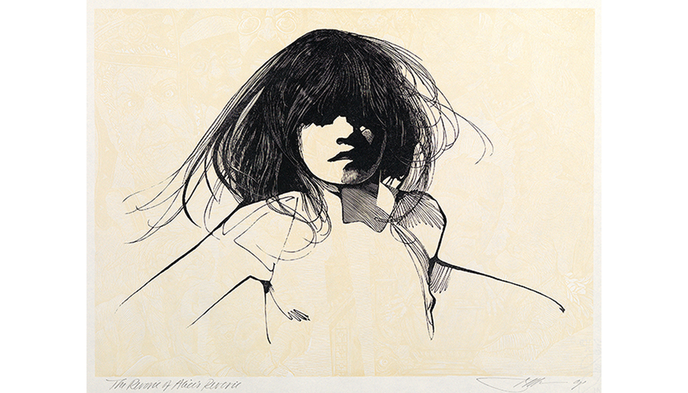
After designing and illustrating editions of Alice’s Adventures in Wonderland and Through the Looking-Glass and What Alice Found There in the 1980s, Barry Moser was trying to decide what his next project should be. The Wonderful Wizard of Oz seemed like a “logical follow-up,” as he put it, even though he hadn’t read the book. However, he knew that like Lewis Carroll’s stories about Alice, it was an adventure starring a girl in a fantastical land. When Moser read The Wonderful Wizard of Oz he was not especially impressed with L. Frank Baum’s prose or the original illustrations by W. W. Denslow, but he was “struck by the parallels . . . between the stories of the two little girls.” He made the case that Dorothy is an American version of Alice, and he created illustrations that reveal the similarities between them.
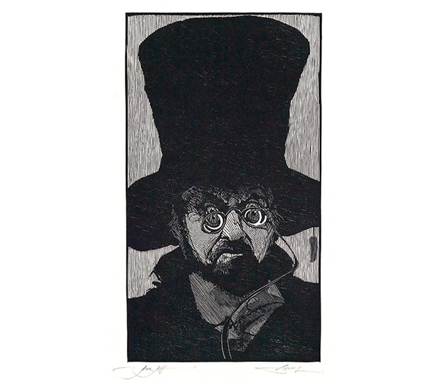
Moser saw numerous elements of the stories that mirrored each other, primarily the heroines themselves. Both Alice and Dorothy are kind, sensible young girls caught in strange places and trying to find a way home. To demonstrate their similarity, Moser used the same model for Dorothy (his daughter Madeline, Smith class of 1994) that he had used for Alice. Another comparison he made between the stories was the way the heroines start their journeys. Alice falls down a rabbit hole and Dorothy is lifted up by a tornado, which, although they go in opposite directions, are both funnel-shaped spaces. In addition, both heroines encounter bizarre people, talking animals, and monsters. These strange and sometimes dangerous interactions made the stories seem more like nightmares than whimsical adventures, so instead of creating typical, cheerful children’s book illustrations, Moser said he “approached the images from a distinctly adult point of view.” He embraced the creepiness of Wonderland long before Tim Burton did in his movies, and made many of the characters, like the Mad Hatter below, look unsettling.

Barry Moser. American, born 1940. The Mad Hatter, 1982. Wood engraving printed in black on medium weight, smooth, cream-colored paper. Gift of Elizabeth O’Grady and Jeffrey P. Dwyer. SC 2014.54.59.
Moser also incorporated political satire into the illustrations for both stories. In Through the Looking Glass and What Alice Found There, the figure of Humpty Dumpty is based on former president Richard Nixon. Moser decided to take the satire further in The Wonderful Wizard of Oz. He said he “peppered it with more than a few political comments, like Ronald Reagan cast as the Wizard—which makes my Oz a bit nightmarish, as so much of politics is.” The absurdity of American politics is a natural fit for the strangeness of Wonderland and Oz.
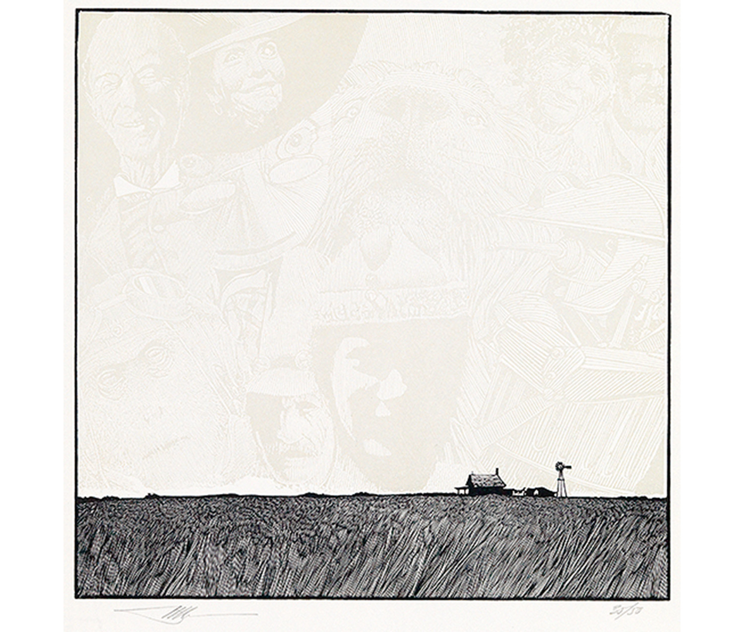
The physical settings of the stories were very important to Moser, and they provided a way to contrast Alice’s and Dorothy’s experiences. In Moser’s mind, the voyages of the heroines represent the landscapes in which they live, with Alice in the small, enclosed spaces of England and Dorothy on the wide open Kansas prairie. Think of Alice eating a magic mushroom to shrink herself so she can get through the door to the rose garden, and Dorothy walking through the huge field of poppies. Moser referred to these as claustrophobic and agoraphobic spaces, respectively, and contrasted them in both the design and illustrations of the books. The books about Alice have marginal notes that enclose the text, while The Wonderful Wizard of Oz creates a sense of spaciousness through the nearly-square shape of the book and the open margins.

Barry Moser. American, born 1940. Home Again from The Wonderful Wizard of Oz, 1985. Wood engraving printed in black and grey on medium thick, smooth, white paper. Gift of Elizabeth O'Grady and Jeffrey P. Dwyer. SC 2014.54.58.
Home Again is an excellent example of Moser’s use of space in The Wonderful Wizard of Oz. Dorothy’s farmhouse is very small and low in the image, dwarfed by a long, flat prairie horizon and a huge expanse of sky. The sky is not empty, but instead full of faint images of the characters Dorothy met on her journey through Oz. Although it’s crowded with faces, the illustration preserves the sense of vast open space that is integral to Dorothy’s story.
Alice and Dorothy came from different continents and their journeys took them to different magical lands, but the heroines do have a great deal in common, from their personalities to their experiences with strange creatures and nonsensical situations. Barry Moser realized how similar they were and cleverly demonstrated it in his illustrations.