Less is More: Josef Albers
Julie Warchol is the 2012-2013 Brown Post-Baccalaureate Curatorial Fellow in the Cunningham Center.
“What counts here – first and last – is not so-called knowledge
of so-called facts but vision – seeing.”
– Josef Albers, Interaction of Color (1963)
The grandfather of Minimalism, Josef Albers was a prolific painter, printmaker, designer, and teacher who illuminated the importance of astute perception and restrained expression. Formerly a teacher at the Bauhaus in Germany, Albers profoundly influenced twentieth-century American art as a teacher at Black Mountain College and Yale University. His famous color course took a radical approach to the application of color in art and design. Rejecting traditional theory, Albers stressed that color is inherently unstable and dependent on its relationship to adjacent colors. He taught his students, many of whom later became influential artists in their own right (Eva Hesse, Robert Mangold, Chuck Close, Richard Serra, and others), to trust their vision and use color in experimental ways.
The culmination of Albers’s seminal color theory, which he developed along his thirty-six year teaching career, was the publication of his book Interaction of Color in 1963. The book is a lengthy summary of his teachings in the form of poetic instruction and theory accompanied by a stack of 80 sheets which serve as the visual representation of Albers’s principles and exercises. Because Albers distrusted the inaccuracies of reproduction produced by conventional commercial printing processes, each color for his illustrations was instead individually mixed in ink and screenprinted. Consequently, each sheet is an original screenprint. This process was the gateway for Albers into the world of screenprinting as an important aspect of his own work, which he continued until his death in 1976. Originally the book with screenprinted illustrations was produced as a limited edition publication, but began being distributed as a paperback book with only 10 high-quality (but not screenprinted) color plates selected by Albers in 1971. While SCMA is fortunate enough to have one of the original 1963 editions of Interaction of Color in its collection, the book is now widely available in its abridged form and serves as a fundamental text for artists, designers, and students today.
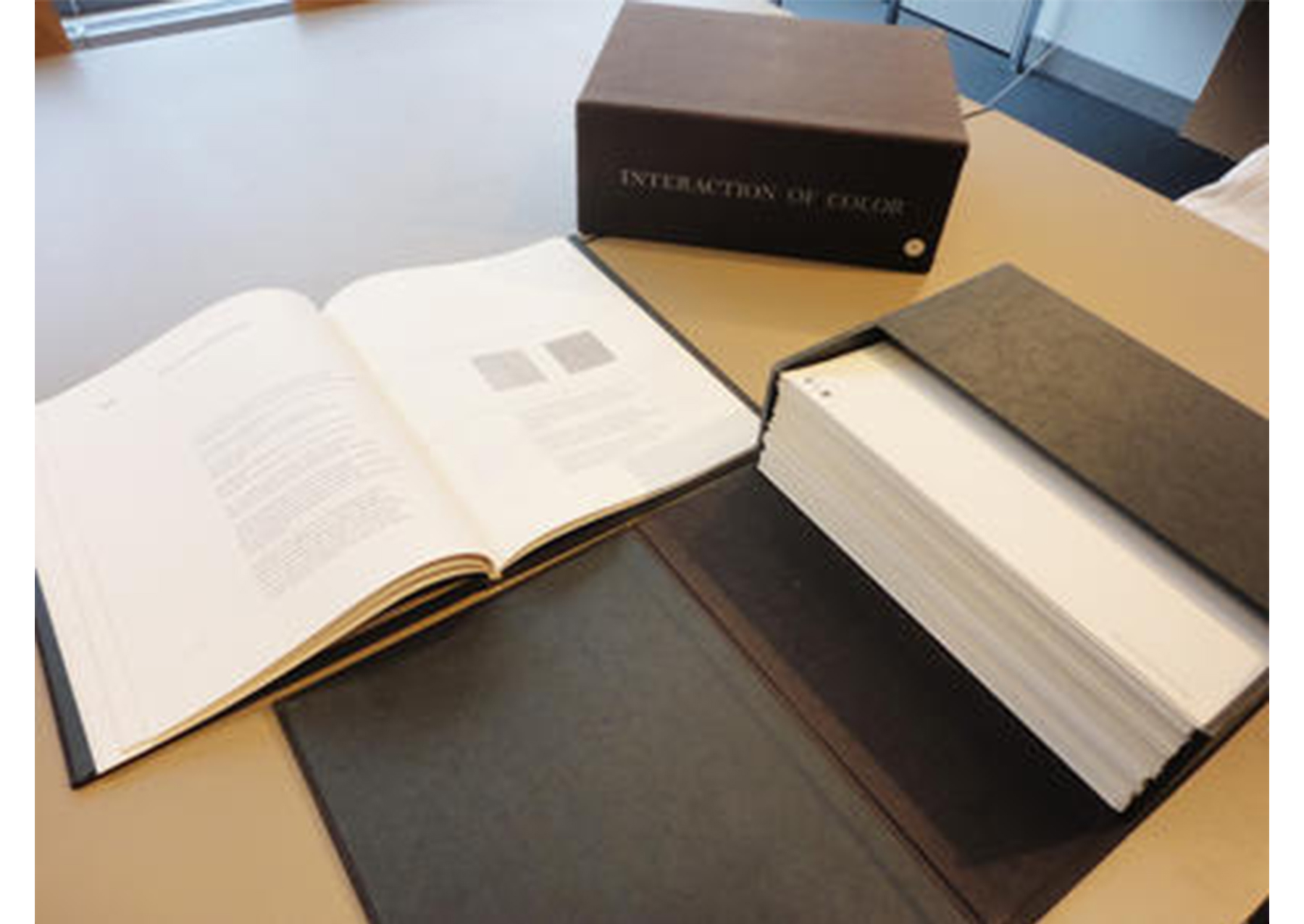
Josef Albers. American born Germany, 1888–1976. Interaction of Color, 1963. Paper covered cardboard portfolio containing eighty screenprints on paper. Gift of Mrs. Albert L. Arenberg (Claire Strauss, class of 1922). Photography by Julie Warchol. SC 1975.3.2. View of book (left), book case (center), and stack of screenprinted illustrations (right).
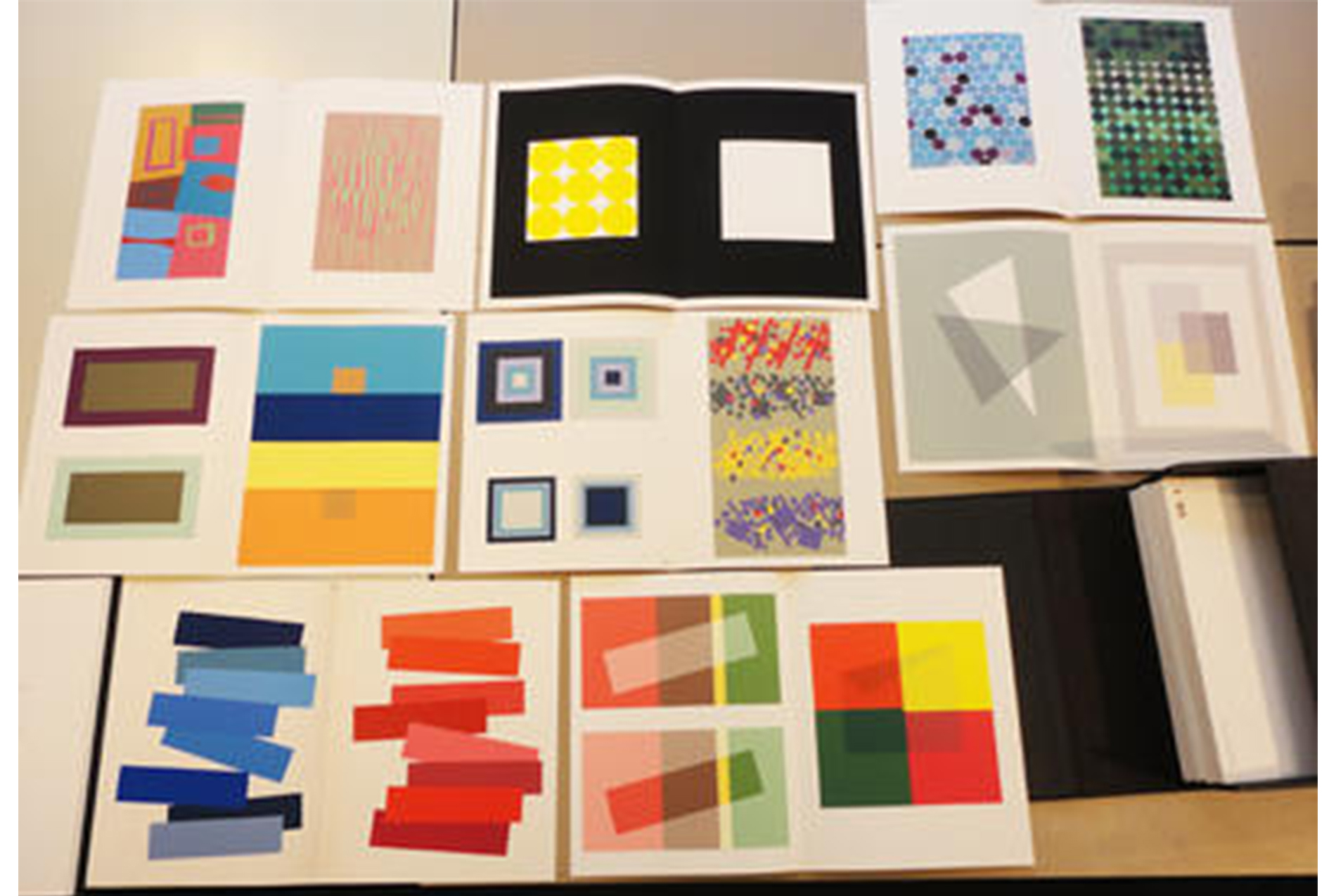
Josef Albers. American born Germany, 1888–1976. Interaction of Color, 1963. Paper covered cardboard portfolio containing eighty screenprints on paper. Gift of Mrs. Albert L. Arenberg (Claire Strauss, class of 1922). Photography by Julie Warchol. SC 1975.3.2. View of several screenprinted illustrations in Interaction of Color.
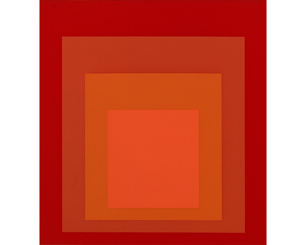
In 1961, inspired by his work developing Interaction of Color, Albers began making prints inspired by his famous Homage to the Square paintings. All of the Homage to the Square images use his standard square composition to display the visual effects of innumerable color variations. Working with master printers to execute his graphic works, the artist relished the meticulous and collaborative printmaking process. Since Albers’s prints required precise execution, printers were often driven to create new technical approaches to satisfy his needs. Master printer Kenneth Tyler, of Gemini G.E.L. and Tyler Graphics Ltd., worked with Albers on many of his prints and subsequently worked with many Minimalist artists. According to Tyler, “Albers’s geometry had to be whistle clean. And this placed a new demand on the medium.” This was extremely different from prints made by “the sloppy school of the Abstract Expressionists, where whatever shapes are found by accident are made images.”
In his screenprints and lithographs, Albers found a technical means to negate the artist’s hand and create images which are arguably more inexpressive than their hand-painted cousins. Albers believed that removing all evidence of individual expression creates a more powerful visual impact. In Homage to the Square – MMA-2, Albers constructs a subjective experience for the viewer, who perceives each shade of saturated red ink in relation to its adjoining colors. It is an endless exercise of subtle comparison.
Homage to the Square – MMA-2 is currently on view in Less is More: The Minimal Print (Feb. 3 – May 5, 2013) on the second floor of the Smith College Museum of Art. The original 1963 edition of Interaction of Color can be viewed by appointment at the Cunningham Center for the Study of Prints, Drawings, and Photographs.