Maya Lin The Geography Lesson
The exhibition Maya Lin: Mappings opens on January 28, 2022. Organized in cooperation with Maya Lin Studio, it features drawings, prints, sculpture, and an online project, representing some of Lin’s major artistic themes between 1999–2022.
Aprile Gallant is the Associate Director of Curatorial Affairs and the Senior Curator of Prints, Drawings and Photographs and the organizing curator of Maya Lin: Mappings.
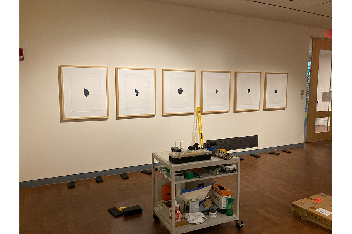
I am particularly pleased that this show will be the debut showing of artwork by Lin that is in the SCMA collection: a portfolio of prints called The Geography Lesson (1999).
Lin has made only two print series, Flatlands (1997) and The Geography Lesson (1999). Two impressions of prints from Flatlands series are in the collections of The Museum of Modern Art and The National Academy of Design; SCMA has a complete portfolio of six prints from The Geography Lesson. Both series are monotypes, meaning they are unique. To make them, Lin used sheets of tempered glass to form the matrices for each unique image. After ink was applied to the surface, she hit a corner of the glass with a hammer, shattering the sheet. She selected fragments of glass that she found visually interesting and printed them in relief.
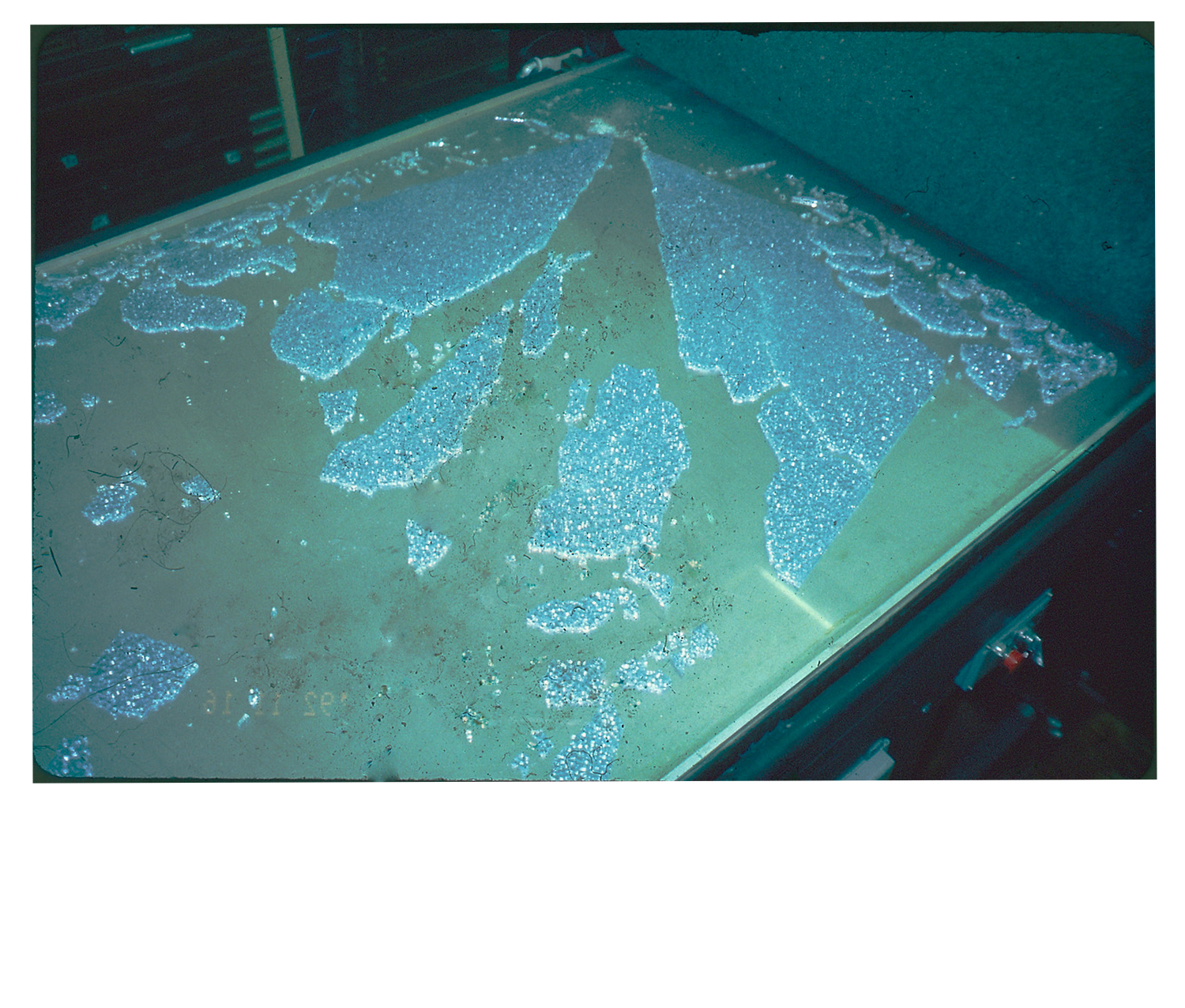
Shattered glass on the press bed. Image courtesy of SOLO Impressions, New York.
I was fortunate to be able to discuss the making of The Geography Lesson with the publisher, Judith Solodkin of SOLO Impressions in New York. Solodkin was inspired to work with Lin after seeing prints from the Flatlands series in an exhibition at the Grey Art Gallery, New York University, in 1998. The next year, she invited Lin to create new works which became The Geography Lesson.
The Geography Lesson is an ambitious project. To realize it, printer Chris Erickson first inked two large sheets of tempered glass, one in dark prussian blue, and the other in an orange brown. After shattering the sheets, Lin surveyed the results, “looking for unity” within the fragments. She then eliminated all the sections she didn’t like, collecting the remaining pieces in metal trays. Each fragment was centered on the press and printed. According to the artist:
The natural fissures and cracks that resulted from the fracture mimic what occurs in the natural world. The prints evoke the patterns found in glacial ice floes, frozen rivers laced with cracks, or of a simple landmass. They are images of landscapes, mappings, and a study in geography.
The series was named after the prints were completed, which reflects the intuitive nature of Lin’s process. I love this image of her leaning over the press. I feel like I can see her level of concentration as she sorts through the sections of glass, relying on her vision in the moment to find the right pieces.
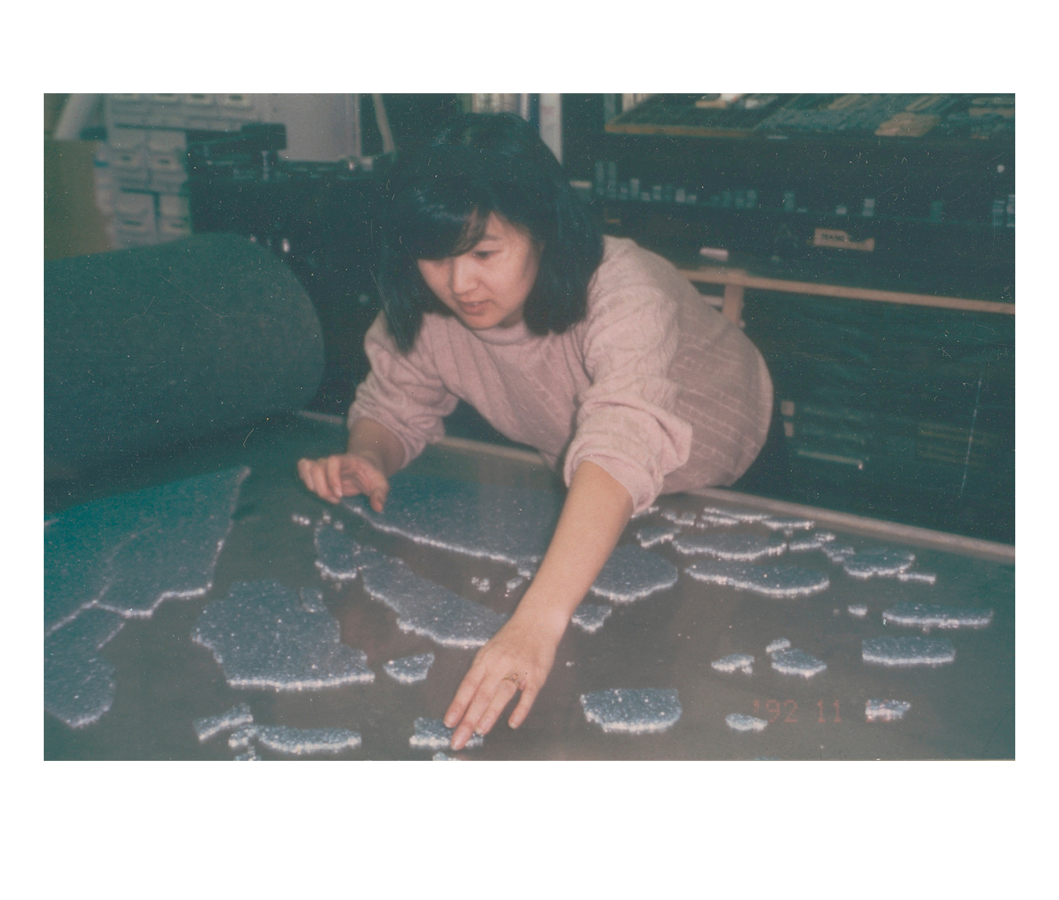
Maya Lin selecting glass for The Geography Lesson. Photograph courtesy of SOLO Impressions, New York.
Several of the prints are very large; Geography Lesson No. 3 in the collection of the MFA Boston, for example, is over 4 feet tall. Some of the dark blue fragments were printed twice, creating “cognates” (which means “related by nature, or having the same ancestral language”) or “ghosts.” These images are light blue. An example of this is , Geography Lesson No. 9 (Ghost) in the collection of the Minneapolis Institute of Art.
The works in SCMA’s collection are one of the three portfolios that Lin made from some of the smaller fragments. Printing on a medium thick sheet of warm white 300 gsm Rives BFK paper allows for deep embossment of the glass while still holding the edges of the form (gsm means “grams per square meter” and indicates the weight of the paper).
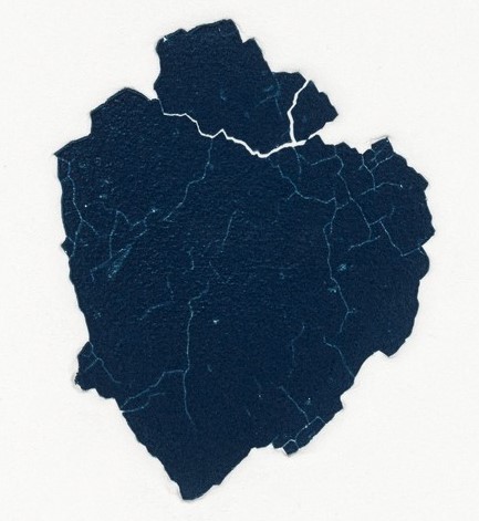
Close-up of an image from The Geography Lesson
This paper choice is one of the things that really give the works a startling presence. Too often, I think, people ignore the quality of paper, which is a huge mistake. Paper is not a mute surface; it hugely impacts how a work looks, and is selected very carefully by artists and printers to maximize visual effects. (Don’t get me started on this. . . I could rant all day, really.)
One of the things I love about these works is noticing how my mind tries to make them into things that I know, so each individual experience is different.
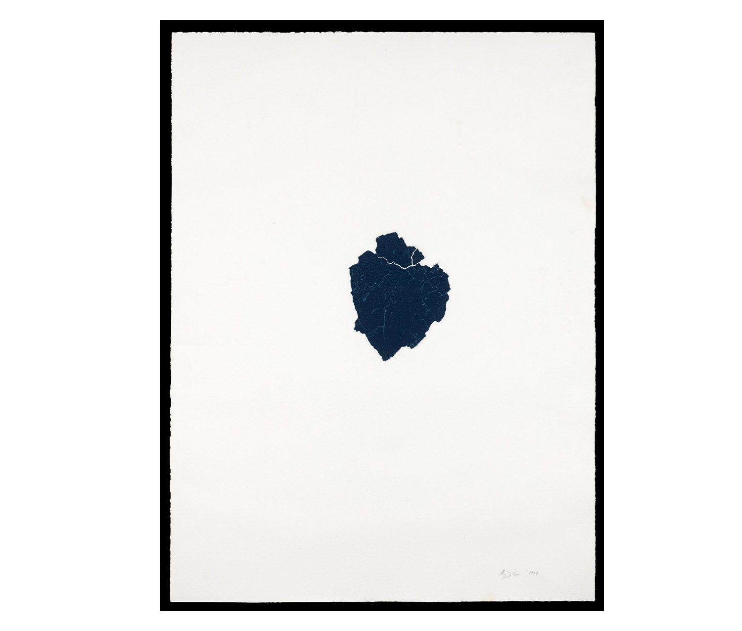
This form looks like a heart to me:
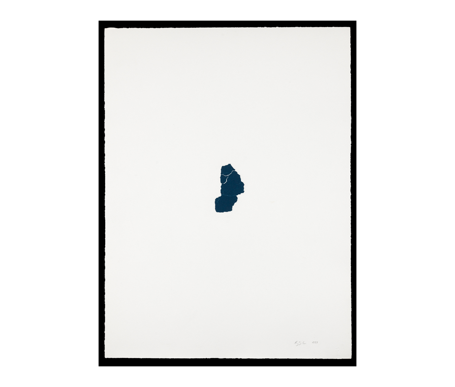
And this group reminds me of a tiny map of the New England states:
These works really need to be seen in person. Although I feel this way about all art, in the case of Maya Lin’s work, being in the presence of the objects is particularly crucial. Her use of scale and materials are impossible to convey through images alone. I hope you all will have the chance to visit to see these amazing prints up close and in person!